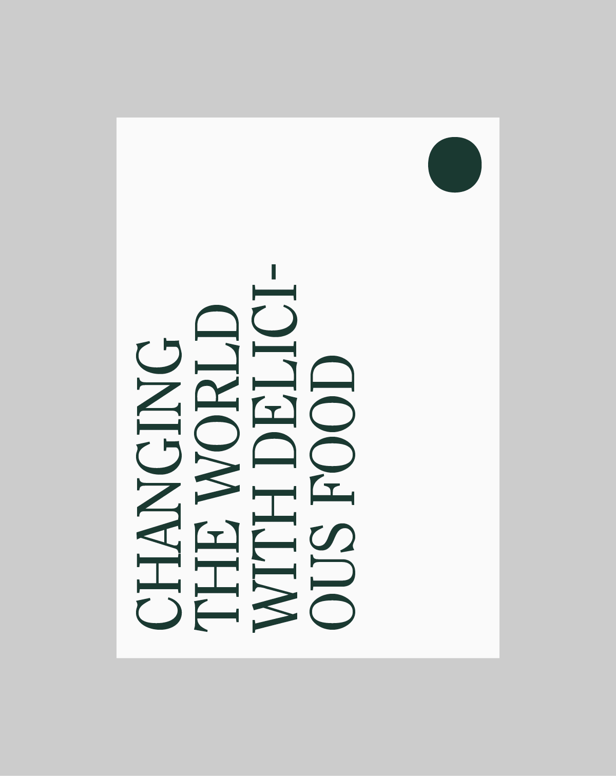
FOOD CULTURE & BEHAVIORAL CHANGE
In Favour of Life
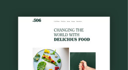
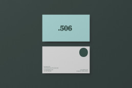
Client: .506 | Type: Branding & Identity | Year: 2018 | Agency: Trouble
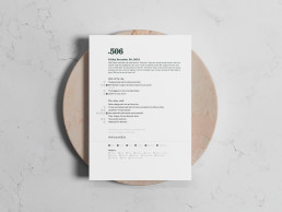
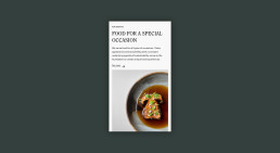
.506 is a culinary lab. Their goal is to create new sustainable food habits by making tasting food that follow a carefully researched set of principles — In favour of life. The challenge with .506 was to design an identity that would balance functionality and elegance. It called for fundamental brand elements that could work both for everyday tasks, but also for special occasions. .506’s design is natural and approachable; it’s made by humans, showing traces of tools handled by meticulous craftsmen. It’s playful, with an attitude that comes from a combination of colors and shapes.

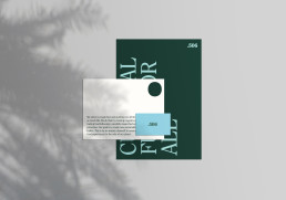
The fonts for .506 is a combination of the no-nonsense sans-serif Untitled Sans and the sensible old-style ITC Clearface. It’s two opposites. A simplification – functional and to the point, and a reformation – back to the craft without unnecessary decorations.
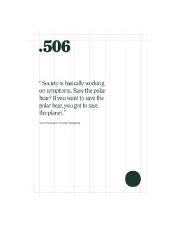
The color palette is based on natural elements. Sweet violets and deep purple. Dusty and stormy blue. Spicy pumkin and earthy ocher. Peony pink & blood orange.